Project 4-“SHE” design process
projectLogo and symbol
At first, my work designed five different forms of symbol shapes. The first is to turn the simple letter s into a soft line shape, but the first symbol is a bit boring. The second is to design “she” as a symbol. The third is similar to the fourth. The shape of the cute face does not match the meaning of the project. The form of the last symbol in the shape of the letter “S.” To make the emblem enjoyable, the letter s becomes a shape where two people hold hands, expressing the meaning of helping each other and peace.
The associations brought by colors are different for different individuals in different cultures. Different genders often have other color preferences, and annual fashion colors may be more attractive to young people or high-income groups. The primary color of this project uses gradual warm tones, giving users a warm feeling. And complementary colors can attract users’ attention.
To the right is the final logo. It has positive and negative verions .
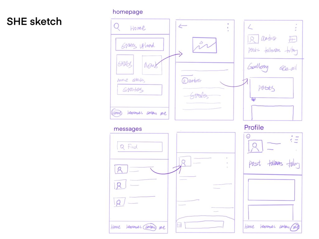
SHE APP Sketchbook
According to previous research, it can be analyzed that some women have suffered gender discrimination, and some women cannot find jobs because of their gender.
For the research analysis, the project “SHE” application is mainly designed into four parts: the homepage, resource page, message page, and configuration file.
The main page is some stories about women, and users can watch the stories posted by people and some news. And users can also upload their own experiences and stories.
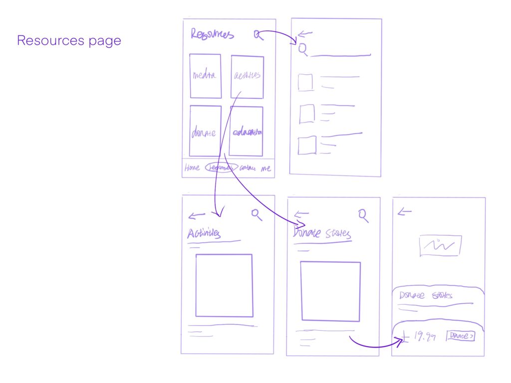
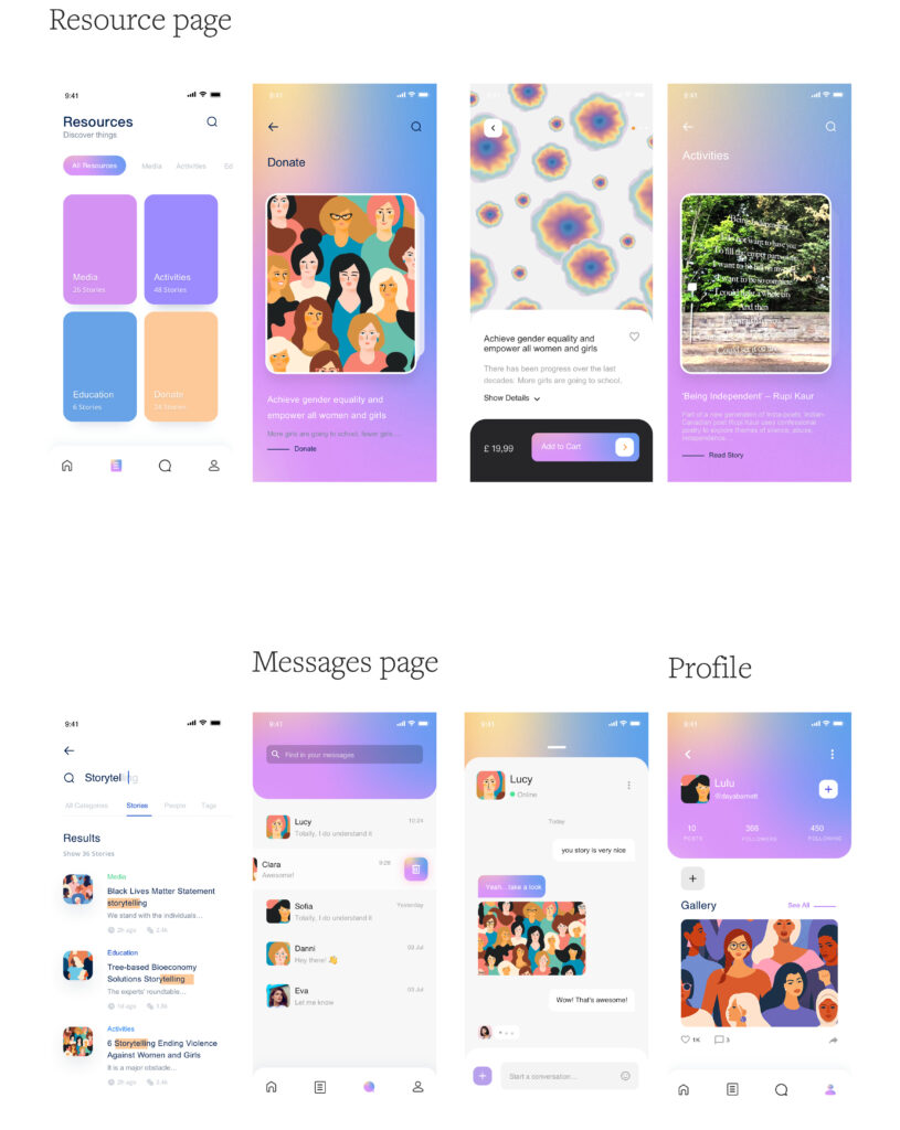
The resources page is composed of media, activities, education, and donations. This page can call for gender equality. In the activities section, users can participate in some exciting activities. Such activity participation can make more people pay attention to the issue of gender equality.
Users on the message page can contact their favorite bloggers. This interactive design can attract more users to use to pay attention to gender equality.
SHE app High-fidelity prototype
The following figure is the high-fidelity flow chart of the “SHE” app.
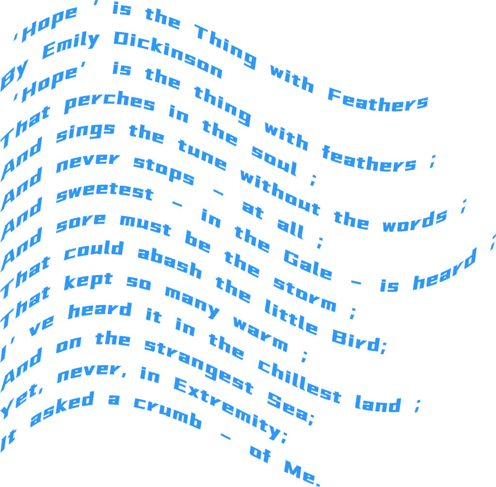
Women poetry avtivity design
This activity will design an activity about female poetry. The purpose is to make more people pay attention to women’s equality.
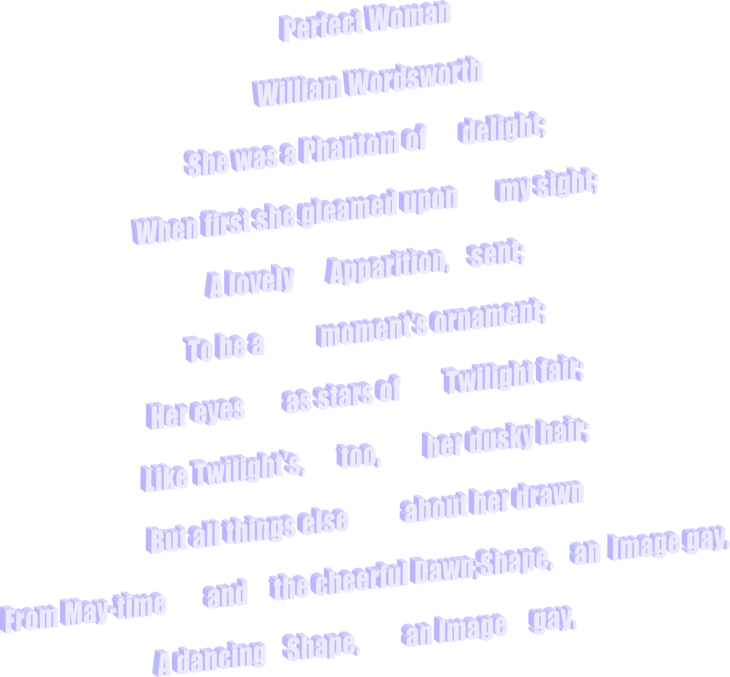
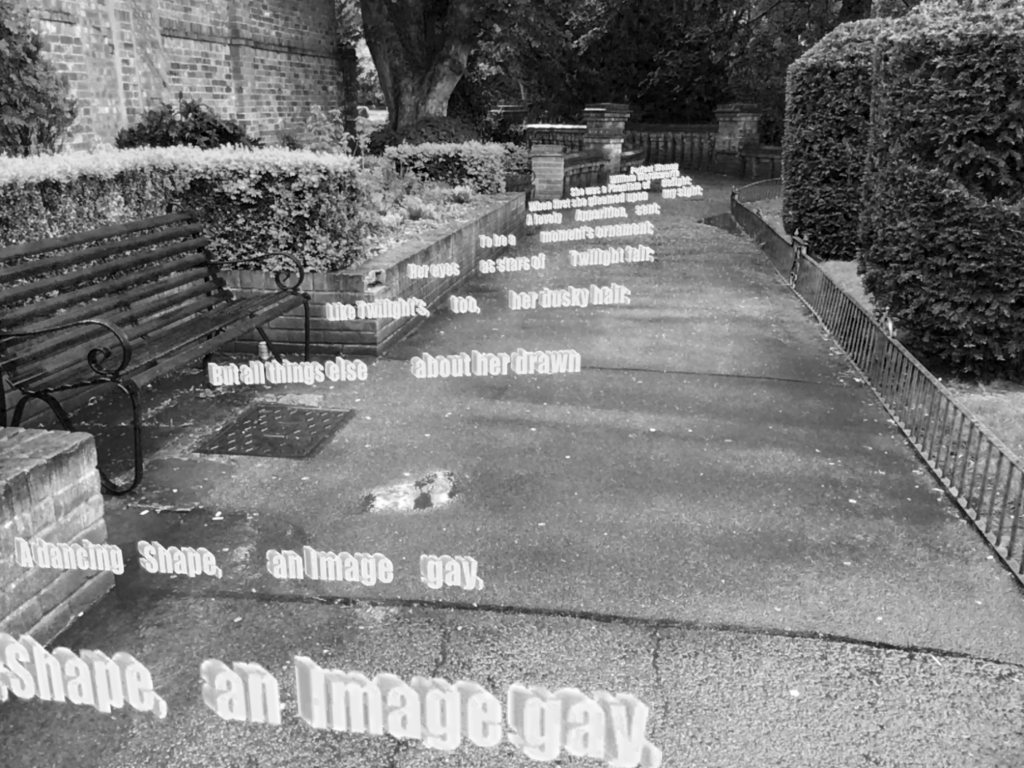
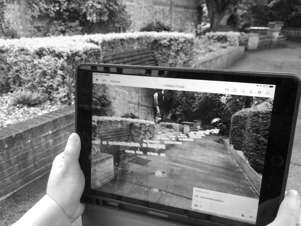
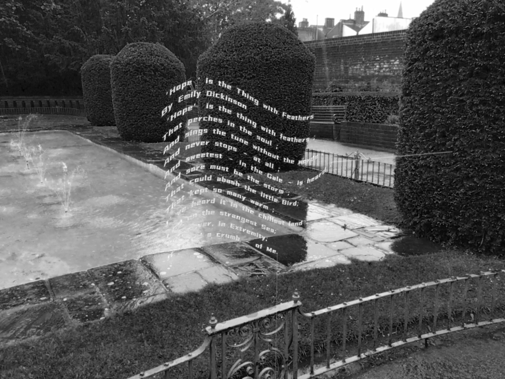
This experimental typography project aims to find a new way of reading and showing poetry. Using Cinema 4D and Augmented Reality technologies, different 3D poems were created and set to appear in the real world around us.
The 3D effect allows users to experience the natural feeling more than traditional posters.

Leave a Reply